Harman Switch Azure vs. Lomochrome Turquoise
12 min read by Dmitri.Published on .

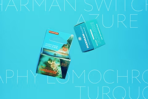
Harman Switch Azure and Lomography Lomochrome Turquoise photographic effect films switch blue and red colours, making faces and skies appear highly unusual while keeping greens green.
Up until last week, Lomography was the only maker of this type of product. But a few days prior, leaked photos of Switch Azure made a few readers and me wonder if Lomochrome Turquoise will finally have an alternative. And so as soon as it dropped, I ordered a few rolls and focused on the shiny new thing for the entirety of the past few days.
In this article, I will compare both films in my small home studio using daylight-balanced lighting, a calibrated colour chart, and a few props. This is not a review — that’s coming next. Instead, it’s an in-depth consideration of both films’ basic properties, based on how they look in controlled settings under various exposures, as well as what they’d do when used “improperly” (bluescaled).
Both Lomochrome Turquoise and Switch Azure cost about $12-15 per roll in 2016. Yet, despite their comparable pricing and similar operating principles, these films look very different — and one of them is much crazier than the other.
Can you tell which is which?
In this article: Guess! How do Harman Switch Azure and Lomography Lomochrome Turquoise achieve their colour effect? Comparison overview and methods. Answer key. Side-by-side normal exposures. Side-by-side exposure tests. Side-by-side bluescale (redscale) tests. The “Static TV” effect. Developing and scanning: what to expect. Which film is better? Support this blog & get premium features with GOLD memberships!
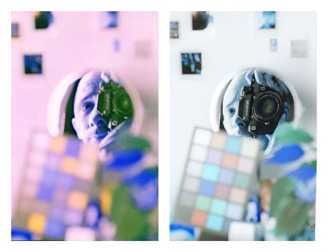
Guess!
Even when exposed under the same controlled conditions and developed in the same Paterson tank, these films look very different.
The answer key is below the fold.
How do Harman Switch Azure and Lomography Lomochrome Turquoise achieve their colour effect?
Both films create the effect of the reds appearing blue and blues red by altering the chemical structure within the layers themselves.
Like other colour-negative films, they use three light-sensitive layers, each corresponding to specific wavelengths (400~500nm for blue, 500~600nm for green, and 600~800nm for red). However, those layers work the same way as they would in black-and-white film: they render shades, not colour.
Dye couplers are chemical compounds that turn each of the three layers a certain colour during C-41 development. Sometime during the manufacturing process, the factories that produce Switch Azure and Lomochrome Turquoise switched the dye couplers in the blue and red channels. Layers that render blues are now sensitive to 600~800nm, and the red-rendering layers pick up 400~500nm.
The Switch/Turquoise effect can be approximated digitally by swapping the red and blue channels. Or you can turn those effect films back into somewhat normal-looking images:
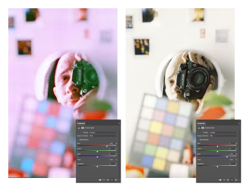
But of course, moving the sliders around in Photoshop is not the same as getting a desired effect straight from film. As you can see, the “fixed” colours above still have issues, especially with rendering the colour red; other problems may appear if you go the other way.
Is this effect worth a try? I think so. I really enjoyed shooting Lomochrome Turquoise (see my review), and I’m looking forward to giving Azure an honest go. Though I doubt many people would want to use this stuff all the time.
Comparison overview and methods.
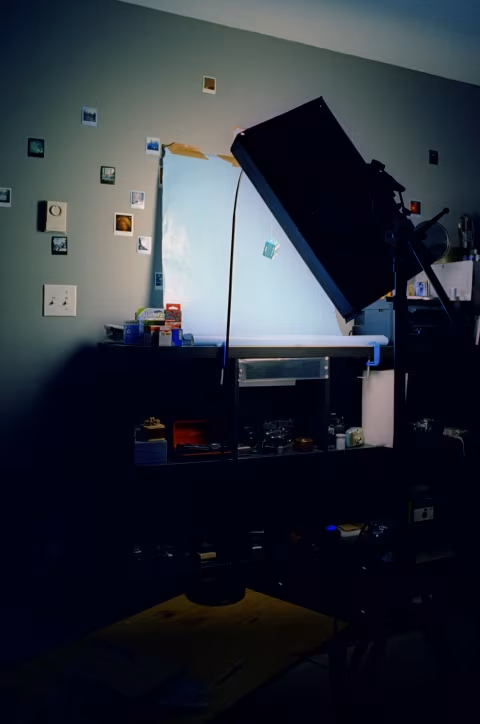
I shot both films under daylight-balanced @5500K Aputure Amaran F21x (95 CRI) with an AI-S Nikkor 50mm 𝒇1.8 on my Nikon F2.
I’ve set up my scene props to capture my face (for skin tones, etc.), a colour chart, and a few objects (mostly film boxes) you may be familiar with. On the right, you’ll see poinsettia, commonly known as the “Christmas plant,” with deep green leaves that turn vivid red at the tips.
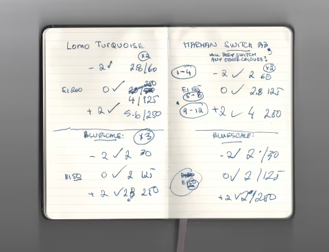
I’m shooting four rolls of film (Turquoise normal + redscaled, Harman normal + redscaled). I’m photographing my scene with three exposure settings (underexposed by -2 stops, normal, overexposed by +2 stops). I photographed each film/exposure with focus on my face and focus on the calibration chart — the mirror was set up to enlarge my face and make it look funky for fun (these are weird films, after all). I’ve also pressed the shutter at least twice for each film/exposure/focus to help with occasional blur; the lights are not very bright, thus I’m forced to open my aperture up for most shots.
In total, that’s 12 to 18 frames per roll. To avoid waste, I’ve split the rolls in half by shooting the first 12 frames and immediately loading them into a Paterson tank in the dark bag before shooting the next set.
Unfortunately, my process caused an issue for the redscaled portion of this test, as the films stuck together inside my Paterson reels (I’ve loaded two strips of ~12 frames in each reel to save time developing in my double-reel tank). This destroyed some of the frames, but the important ones survived — one of which rendered an interesting “static TV” effect. (I call these types of film “bluescaled” as they turn dominantly blue.)
I developed everything in the Flic Film C-41 kit that wasn’t fresh by any means, but I’ve been tracking its exhaustion and compensating for developing times accordingly using Chem Log, which should produce results that closely resemble those from a freshly mixed batch.
I scanned all the film on my Nikon SUPER COOLSCAN 5000ED via VueScan into 16-bit TIFF digital negatives and inverted the files using histogram stretching, either manually or via film Q. I tried to apply colour corrections to match the reference card to a greyscale mask, but that did not always feel productive as one of the films leaned heavily pink, correcting which would cause the image to clip, even at 16-bit. And that troublesome film is:
Answer key.
All side-by-side images in this article are in the following order: