The Biggest Film Test and a New Film Inversion App
A Monthly Newsletter for GOLD Members
10 min read by Dmitri.Published on . Updated on .

I’ve been collecting film rolls and disposable cameras of various brands for several months. This May, I finally had the chance to load all eight of them into my Nikon F2 for an exposure test to determine, once and for all, our actual options for ISO 800 colour-negative film.
In this newsletter, I’ll cover the BTS of that mega-experiment and talk about an update to the film inversion app I’ve been working on since January.
This month’s member newsletter has no paywall (it’s free for everyone).
In this newsletter: Behind the scenes of a film comparison experiment. Coming soon — Drag-&-drop RAW film scan inversions. Support this blog & get premium features with GOLD memberships!
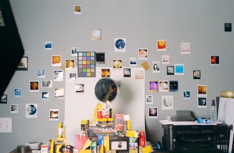
Behind the scenes of a film comparison experiment.
Many of the films we shoot today are largely undefined beyond marketing and vibes-based reviews.
We assume that Kodak Portra / Ektacolor Pro 800 is a more valuable product than whatever comes in a Kodak FunSaver camera or the new Candido 800 films, yet there’s just one factory in the world capable of making this type of film: Kodak.
Kodak and the third-party brands say little about the remarkably large number of fresh ISO 800 colour-negative films sold that aren’t Portra. As a result, we don’t know what those products are.
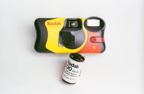
Given how much this type of film costs, it would be good to know if spending on a bigger brand would actually yield better results. And if you are a portrait photographer looking to get the best quality for your clients and portfolio, this may be an even more important question to answer.
The challenge with most reviews and comparisons is that there is no guarantee that a lab scanner profile or the magic mystery code inside Negative Lab Pro will not influence or obscure details that define the film. Whereas some films, like the CineStill 800T with its signature halations, are easy to identify regardless of how they are processed, others become evident only after several rolls and various edits.
For example, I found that one of the ISO 800 films reproduces skin tones less accurately in my tests than the others. But if you don’t shoot many portraits, examine each of your photos closely, or aren’t sure what to expect, you may not notice this deficiency until it’s too late.
With over $200 spent on film and development chemicals, I wanted to be completely sure that if I found any differences between the films, they were not due to external factors, such as scanning or development, and that those differences were consequential for image quality.
This meant setting up a small set with various objects, a test colour chart, and myself as a subject for skin tone evaluation under a single studio LED panel with temperature control. This experiment could absolutely benefit from a more diverse set of subjects, but for now, it’s just me.
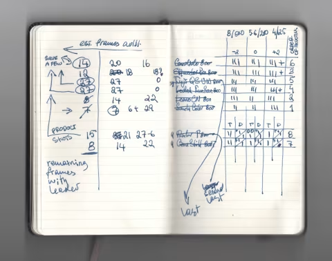
I don’t have eight identical film SLRs to test the films. To avoid the obvious issues that come with using different cameras, I prepared short-end rolls and planned eight mini-sessions for my F2. The goal was to leave just enough exposures on each roll so I could go through all the test scenarios, switch, and repeat without changing anything about the scene, the lens, or the camera.
This involved exposing 10-18 frames of each of the eight films before the experiment (either during my daily dog walks or to produce supplemental material for upcoming reviews), then transferring those shot frames directly into the development tank from the camera inside the dark bag. This left me with eight rolls, each containing about 12 frames. Some of the films, like those I’ve extracted from disposable film cameras, were already short (27 and 24exp.), so I had to adjust my calculations accordingly.
Scene setup, exposure, and film development were all done in one day, but it took several days to scan everything, edit those scans, compare them, and document the findings.
The process of scanning and inverting those scans is prone to producing small differences in colour, even when done with the same hardware at the same time. A slight change in light direction, a minor shift in the film’s location in the holder, dust, and other factors can affect the image. To ensure that those differences, as well as slight colour drifts that could occur due to storage and transportation (which would be different for all those films as they are coming from different stores), I’ve colour-corrected every single one to ensure that the blacks, the greys, and the whites in the colour chart are neutral using the greyscale masking technique. I’ve also adjusted the brightness levels across all films so that the greyscale swatches look identical for the same exposure settings (with some exceptions that wouldn’t allow it — see the experiment method section for details).
After normalizing the grey points across all the films, which I scanned as positives with fixed neutral settings and inverted in film Q via histogram stretching — a simple, consistent, easy-to-replicate method that does not alter the colours, consistently infers contrast, and preserves all available depth. By this point, differences between the scans were limited to just the film’s capabilities. Those differences could include colour sensitivity (how well the film reproduces subtle colour transitions), colour palettes (which colours does the film use to reproduce real-life colours and how they work together as a whole), and contrast.
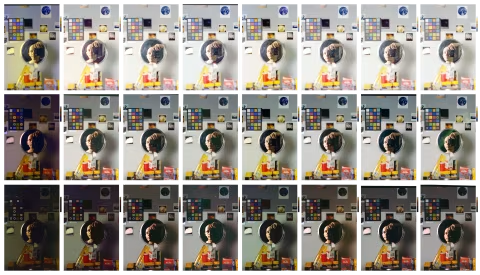
Having put all that together, only a few films stood out at first glance — CineStill 800T and Amber T800 — for their decreased sensitivity in the shadows and the halations, and Candido 800 for its green/yellow cast.
But that’s a lot of films and a lot of things to look for. Aside from Candido and the tungsten films, most frames looked similar, while the sheer number of images in the set felt overwhelming. In fact, it’s at this point that I felt the least confident in my data.
Raw data is rarely helpful, precisely because a good set is usually so large it’s overwhelming. So I moved on to the next step: analysis.
First, I’ve selected ten key colours from the Datacolor Spyder Checkr colour chart: white, black, deep blue, green, and several fleshy shades of brown, red, and yellow. I’ve copied all of them onto a larger chart that spans all the films and exposure settings — a total of 240 swatches!
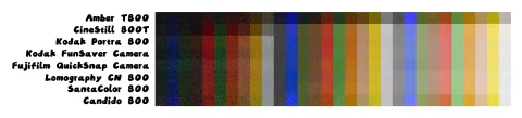
Having done all that, I took a moment to pat myself on the back, only to realize that the swatch overview was not illustrative enough. At this point, it was still possible that the differences were just minor shifts due to scanning, storage, inversion, or other mistakes in the process.
Ten colours were not a comprehensive enough sample to compare these films. If there was an actual difference worth spending money on, I needed a more definitive illustration.
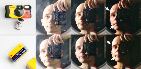
The reason I picked yellow, red, and brown on the colour chart is that these colours correspond to skin tones, which we have evolved to distinguish exceptionally well (Shimakura, Sakata, in 2022 Vision Research paper). Yet the swatches were very limited in colour variation, so I moved on to examining my portraits.
The first film I wanted to check was a roll I extracted from the Kodak FunSaver camera, which looked most similar to Kodak Portra / Ektacolor Pro. It felt logical that Kodak could be placing the same material there… Yet I did find a meaningful difference:
While normal and +2 exposures looked identical, the FunSaver colours looked significantly worse when underexposed than Portra’s. In the dark, the former made my skin look orange, and the distinction between my lips and the rest of my face became hard to notice, whereas the latter still looked relatively natural and showed a clear distinction between my lips and the rest of my body.
This is the smallest difference I found between the films. Other brands look less alike. The markings and sometimes the base colour of the negatives themselves looked different, too:
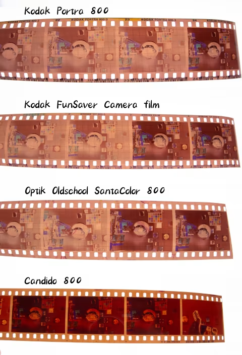
Whether those differences are important will depend on the project. They may not be easy to spot at first, yet there’s a good chance that even a small change in the film’s colour gamut can play a key role — especially in portrait photography.
Only two of the films in this test could be considered identical (as they carried the same edge markings). The rest were a little or a lot different from each other.
Read “Comparing All (8) ISO 800 Colour-Negative Films” for a complete experiment breakdown.
This experiment would not be possible without an app that inverts hundreds of film frames in batches without altering any of the film’s core characteristics.
That app’s name is film Q — and I have an announcement about it:
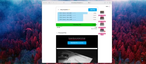
Coming soon — Drag-&-drop RAW film scan inversions.
I built film Q because I wanted an app that uses the most direct way to invert film negatives and functions like a darkroom.
Frustrated with tools that left me wondering whether the colours or the contrast were coming from the film or the software, I built a prototype in 2022 to better understand the process.
It was a small script that used histogram stretching on my local machine. film Q analyzed each image automatically, required no cropping or sampling of the border colour, and didn’t rely on a flawed list of presets. It didn’t need any other app, and it had no dials or settings — it simply inverted film scans, no sugar.
My scanning process changed from accepting output from hard-to-control apps and their many dials to a stream of positives that could be quickly sorted, like a contact sheet, to surface the best images for the next step. The winners sometimes required colour balance adjustments, same as darkroom prints, but those adjustments would be within my control, and I could make them in an image editor built for the purpose, like Photoshop, Affinity, or DarkTable.
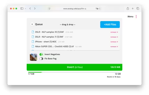
Today, film Q runs on a small cluster of computers that works with Dropbox to automatically begin inverting film negatives as soon as they’re added to a folder. But because it relies on Dropbox for storage, it’s missing the complete independence from third-party software it enjoyed on day one — this will change.
On June 16, I will begin rolling out a new drag-and-drop experience that will work on any internet-connected device with a browser and require no Dropbox account.
This upgrade adds a secure file storage system, a new web interface, and significant infrastructure changes — so please bear with me as some issues may occur.
The Dropbox integration will continue to work, but like the rest of the app, it should become a little easier to use.
I think that this upgrade will make film Q the easiest, fastest, most reliable, and most accessible film inversion app out there.
Thank you to all who made this work possible through donations and membership subscriptions. This is not something I could’ve done on the side.
The above is this month’s summary of the things I built and wrote for GOLD members only. There are several new articles and editorial news items on the website since the last time I sent this mail — plus a new podcast episode added every month — check them out if you haven’t already.
I’ll summarize all that’s newsworthy in the world of film photography in the upcoming newsletter (Tuesday next week).
Thanks so much for your support!
— Dmitri.
