38 Things I Learned From a Roll of Rollei Infrared
Discovery Through Self-Critique
23 min read by Dmitri.Published on .

Rollei Infrared (reviewed here) is a high-speed black-and-white film with sensitivity up to 750nm on the light spectrum — enough to make trees glow and water appear black with a dense red filter.
The more I shoot this film, the more I like infrared photography, which is fantastically more affordable on black-and-white film than in colour. Exposures are tricky as the light is literally invisible to the human eye — yet successful ones can look very impressive.
The Wood effect is a well-known phenomenon that makes foliage appear as bright as snow on infrared film. Robert W. Wood (physicist, inventor), who made a filter capable of isolating infrared and ultraviolet light, described what he saw brilliantly:
Their chief peculiarity lying in the intense blackness of the sky and the extreme brilliancy of the trees and grass. They resemble snow-covered landscapes in bright moonlight more than anything else.
(Quote stolen from “The Physics of Near-Infrared Photography” paper.)
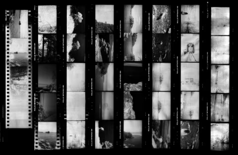
These are all the 38 frames my camera managed to squeeze out of a 36exp. expired roll of infrared film — in the order in which they appeared.
Join me as I examine this roll in its entirety and discuss my mistakes and successes within each frame (along with a few new things I’ve learned about the nuances of shooting infrared film)!
On this roll: Light leaks. Exposure and focus check out. Weak IR effect. Boring. Haze and blur. A tricky focus situation. Busy. Not enough DR/overexposure. A fun shot, but not the best. Didn’t react fast enough. A nice photo of a soaring eagle through the canopies (but not enough contrast). I’m glad I tried again later. (Almost) perfect. Not sure about this one. Poster material (needs crop). UBC 1. Love the texture, but I’m not sure about the geometry. Great composition, some issues. UBC 2. Missed focus. Missed focus 2. Perfect conditions at Whytecliff Park. A less good Whytecliff. Noodle-ball! A less good Whytecliff shot 2. It’s probably the clouds. Noodle, stick, ocean. Noodle-Wood effect? Lens blur 🤝 motion blur. Whytecliff 4. Squamish brewery. Abandoned (?) railway. A non-portrait. Ugh, the haze. Good shot but overexposed. Frame 36. Many bright things. Medium format would’ve been nice. Support this blog & get premium features with GOLD memberships!
Light leaks.
The first frame had a strong light leak. Thankfully, it was a mild malfunction — with the following frames improving as the film coiled deeper into the 135 cartridge, away from stray light entering through the slit.
You can see exactly how this damage formed on the contact sheet above (frames 1-5 showing some leaking and six-onwards looking completely clean).
Exposure and focus check out.
The second frame still had burned edges, but the exposure and focus are spot-on.
Weak IR effect.
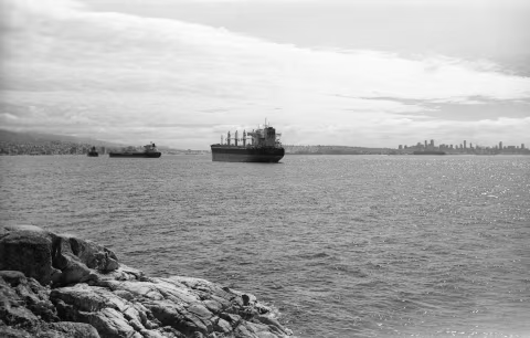
The light leaks are almost negligible here, but the infrared effect is not very apparent. This image looks like it was shot with a regular black-and-white film.
Boring.
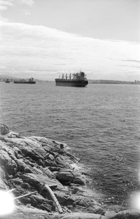
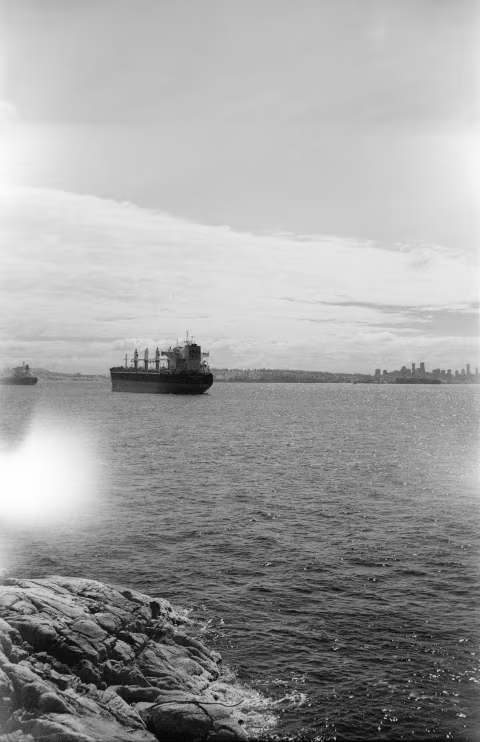
Frames 2-4 are all looking pretty much the same and not particularly interesting. Although those are some impressive ships!
Haze and blur.
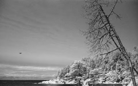
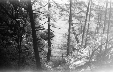
Frame five seems a little more engaging. There’s a very apparent Wood effect in the trees, and the water is very dark. But it’s not particularly sharp due to a combination of motion blur with a shutter set to 1/250s and a very fast bird — plus an imperfect focus with a rangefinder.
The skies are very light in all the frames so far, even though they did not seem nearly as hazy on the day. It was a hot week here in Vancouver with temperatures rising above 30℃/86℉. Only a thin veil of white water vapour escaping from the forests made the skies appear lighter but not nearly as much as this film shows.
Perfectly clear skies look black on infrared film, but it’s very sensitive to water vapour, which is why the skies it rendered here look overcast.
A tricky focus situation.
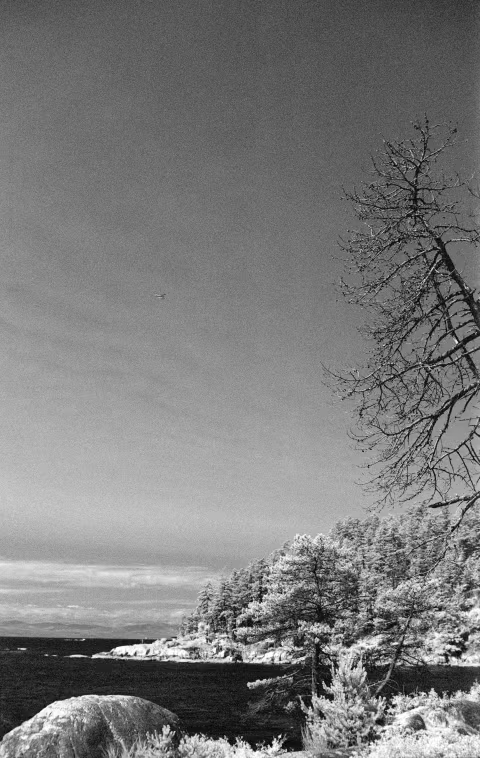
Frame six had the chance to look interesting as a print if it not had been for the focus. When I set up my camera, it was focused on the trees on my side of the rocks (you can see it best on the branches on the top-right). However, the distant rocks and trees were not perfectly in focus, nor were the rocks on the bottom-left. While the f5.6 aperture I used here may seem small enough to keep most of the scene in focus, it can still produce noticeable lens blur on a 50mm lens, especially when enlarged.
Busy.
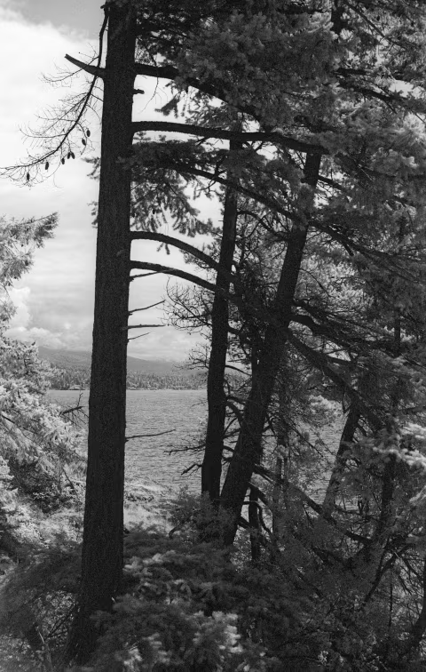
Frame seven was fun to see pop up in film Q as it inverted my scanner’s output. The Wood effect is apparent in the pine needles and the distant trees — although it’s not as strong as it could be. The grain is also quite noticeable. I think something like this could look good if shot on a medium or a large format camera and printed big — but in its current form it looks muddy.
Not enough DR/overexposure.
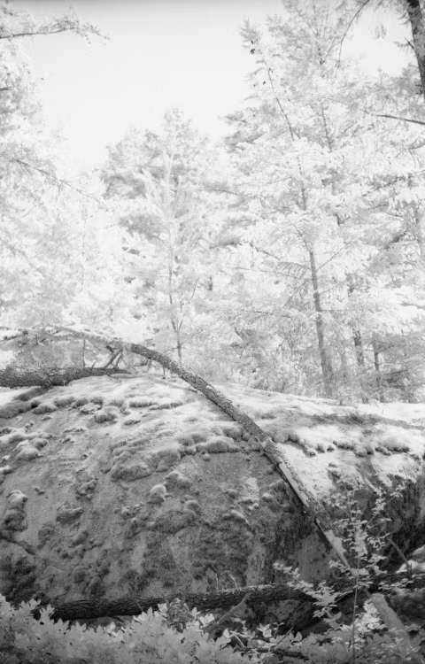
This frame was a wrong scene choice for this film. Up until now, I haven’t made any edits to my frames, but for this one, I had to reduce the brightness considerably. The difference between the highlight and the shadow areas was too great for the film’s somewhat limited dynamic range, and I was thinking too much about preserving the shadows.
A fun shot, but not the best.
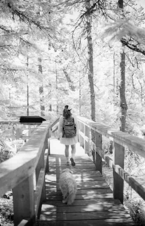
Frame nine has good focus and good exposure. I used the Sunny 16 rule estimates for all my exposures, and this particular shot was a little tricky as it was in the shadows with a lot of variations between bright and dark spots — I’m happy with what came out of that. The Wood effect makes the canopies look brighter than usual, which is fun, but the photo itself doesn’t tell a deep or particularly compelling story (other than for me personally as a memento of this hike).
It’s cool to see how dark the pinecone looks on the background of snow-white canopies.
Didn’t react fast enough.
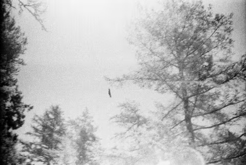
We saw an eagle soaring above us, and I instinctively pointed my camera at it. However, my exposure was still set for the light under the canopies, and I didn’t have the chance to focus. I don’t particularly feel bad about this blunder, as the next frame worked out fine:
A nice photo of a soaring eagle through the canopies (but not enough contrast).
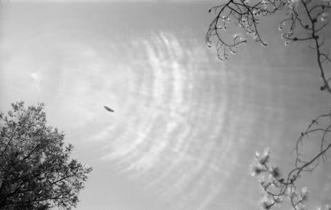
Frame 11 came out looking OK, though it could still be better. I like how crispy the bird looks and the bokeh from the nearby branches. I like how bright the leaves look on the right — like cherry blossoms.
Unfortunately, the suboptimal weather and lens flares on my 1957 Ultron lens lowered the contrast, making the eagle (though sharp) appear a little hazy.
I’m glad I tried again later.
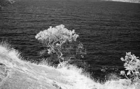
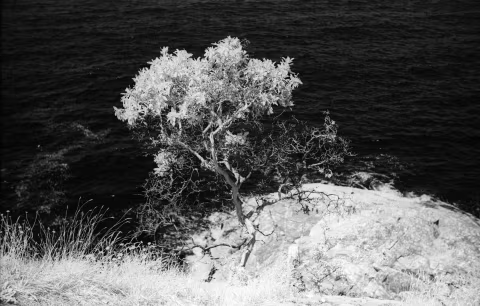
The grass and the leaves in this shot may imply overexposure, but the snow-like bright-white reflections of foliage are evidence of optimal Wood effect on IR film. Things that are alive look very white, yet there is still detail and nuance on each leaf — something you wouldn’t get if the image was actually overexposed (the quality of exposure can be opinionated, of course).
I really like the contrast here with the water, and the focus is spot on. I wanted to capture the arbutus tree; to do that, I had to focus on it and then re-adjust the focus for IR before shooting it. On film, you never know if that works, but in this case it did. The soft lens blur around the tree gave it more of a spotlight.
The composition here is not great, however. The image would look better if it were cropped. Thankfully, I don’t have to contend with that as I reframed in my next shot: