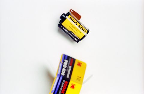
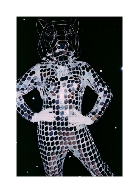
If you’ve been shooting film for any length of time, chances are you’ve heard of this product. And at ISO 400 box speed, this is likely the most sought-after colour-negative film. Not only does it hold/held¹ the claim for the finest-grained ISO 400 colour-negative film, but it is also highly colour-accurate and easy to shoot thanks to its wide dynamic range.
Portra 400 was one of the first several colour-negative films I tried when I began shooting film over a decade ago; as such, I’ve had plenty of experience with it to tell a full story, which includes lots of samples from various lighting conditions, colours, an exposure guide, dynamic range tests, and physical negative observations.
I’ll also explain why this product was renamed — as you may have noticed, I’ve used Portra and Ektacolor Pro interchangeably here — and that reason can also be an important indicator of future pricing and availability for this film.
All samples in this article were shot on Portra / Ektacolor Pro 400 film in various cameras between 2022 and 2026. They were scanned on either the Pacific Image PrimeFilm XAs or the Nikon SUPER COOLSCAN 5000ED scanners and inverted with film Q. Some non-destructive colour correction was applied to most frames.
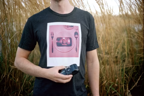
Kodak Ektacolor Pro 400 / Portra 400 with Olympus Mju I.
A brief history of Kodak Ektacolor Pro 400 (formerly, Portra 400).
Kodak Ektacolor Pro 400 is a new name for the premium medium-speed colour-negative speed made by the Rochester, NY factory.
While Kodak did not explicitly state it, Ektacolor Pro is the new name for the Portra series, which is evident from the colours and the quality of the film, as well as the company’s statements explaining that the updated film branding is for “sub-brands of existing Kodak films and offer the same high quality you’ve come to expect from Kodak.”
In other words, whether you’re shooting Ektacolor Pro or Portra, the results should be the same.
That is, of course, unless you’re trying to make something out of the vintage Ektacolor Professional series, which at some point used older developer formulas (C-22 and Kodak proprietary mixes), having been first announced in 1947.
In 1971, the Ektacolor brand was retired by Kodak and replaced with the Vericolor brand, which continued to carry the company’s most sought-after colour-negative series until 1998, when Vericolor III was replaced with the more familiar Portra name. That year, Ektacolor made a very brief comeback as a name for tungsten-balanced sheets (Ektacolor Pro Gold 100T), only to disappear again for 27 years.
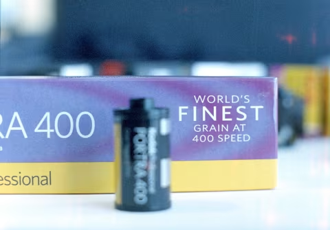
The updated (2006-2026) 5-pack Kodak Portra film box claims the “world’s finest grain at 400 speed.”
In 2006, the Portra series got an upgrade, making it a more accurate and finer-grained choice for photographers. While there may have been numerous changes and various versions (such as the NC and the VC) since, the core technology remains the same today.
The 2026 return to the Ektacolor name has more to do with the distribution, which is now handled by Eastman Kodak Company. Previously, Kodak Alaris — a piece of the company that broke off in 2012 due to bankruptcy — handled ready-made film until it reached stores. This change has been welcomed by photographers, who hoped for better prices and availability of these films — although that may not be the reality for many customers, especially those in Europe².
For the first time in over a decade, Kodak will sell these films directly to distributors, in an effort to increase supply and help create greater stability in a market where prices have fluctuated.
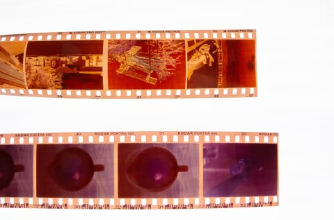
Top: the new Kodak Ektacolor Pro film strip with edge markings. Bottom: the legacy Kodak Portra 400 film strip with edge markings.
Not everything remained the same as Kodak transitioned from Portra 400 to Ektacolor Pro 400. While the colours and overall image quality appear the same, the edge markings have changed — also, Ektacolor Pro 400 is noticeably thinner and more prone to curling than Portra 400.
This can make the job of those developing and scanning film at home a little more challenging. I liked the thicker version better, of course, but in my experience, the downsides of a thinner emulsion are still minimal. The Eastman Kodak Company logo on the new Ektacolor Pro 400 edges is neat.
¹ — The 2006-2026 Kodak Alaris packaging for the Portra 400 film claimed the “world’s finest grain at 400 speed” — a phrasing that has since been removed from the new Ektacolor Pro 400 boxes. This doesn’t mean that the claim is no longer valid; it’s just not listed.
² — Alaris may have been the UK/EU connection for Eastman Kodak Company, as its offices are located in Hemel Hempstead, Hertfordshire, United Kingdom. However, it’s unclear whether that’s what offered lower prices in that part of the world. Film prices are highly volatile and can be very difficult to understand without an industry survey — the noted increase in prices in this article is based on what I’ve heard from photographers in those geographic areas when I spoke to them recently (summer 2026).
Kodak Ektacolor Pro 400 / Portra 400 with Olympus Mju I.
The Ektacolor Pro colours.
When this film was rebranded to Portra in the late 90s, the marketing message was superior skin tones, which is an extremely challenging part of colour photography, even today, when digital presets and workflows are freely available.
Aside from the lovely diversity among us, which inherently adds complexity to colour management, human perception is particularly attuned to this gamut, meaning that inaccuracies and lack of detail are often easy to spot, even for non-creatives (Shimakura, Sakata, in 2022 Vision Research paper). In other words, an accurate skin tone rendering would have to map the tone correctly relative to the rest of the scene and the available light, and also be sensitive enough to pick up the minute differences in our pigmentation (such as wrinkles, hairs, blemishes, birthmarks, tattoos, etc.) across the entire range — because our eyes will look for those things.
There is, of course, nothing wrong with using black-and-white film for portrait photography (although it, too, will have varying degrees of success since most of the details I described above can still be represented in monochrome) or using less accurate stocks. Flattery and documentary may still be valid, even if the details are sparse. Yet this particular stock is Kodak’s best effort at making our bodies look right, and I think they’ve certainly achieved that.
Kodak Ektacolor Pro 400 / Portra 400 with Olympus Mju I.
Ektacolor Pro 400 is a daylight-balanced film, which means that it requires light temperatures around 5500K to get the best results. That said, I was able to get good images on this film with both flash and under artificial lighting in some cases (though some colour correction was usually required).
Good scans should offer substantial depth, giving ample room to edit and modify the results. In my case, the results from Ektacolor Pro 400 would sometimes come out right without any edits, and other times would require considerable tinkering and colour-balance adjustments. I used greyscale masking as one of the colour-correction techniques to get accurate results independent of the print or display gamut.
Kodak Ektacolor Pro 400 / Portra 400 with Pentax PC35AF.
As one would expect, the colours you’ll get from this film will depend on the light, exposure, lens, scanning, and editing. Yet I think that they can still be recognizable as fairly warm. Your shadows may appear slightly blue; shifting those colours towards greys will necessarily warm up the rest of the scene. Fighting this property may be a losing battle and probably not worth your time.
However, if you are looking for a cooler overall palette in your images with similar attention to colour and skin-tone accuracy, you may still find the Japan-made Fujifilm Superia Premium, which does exactly that.
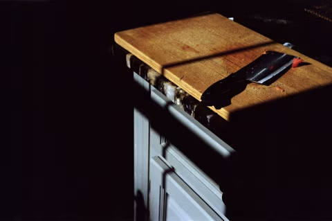
Kodak Ektacolor Pro 400 / Portra 400 with Minolta TC-1.
Dynamic range.
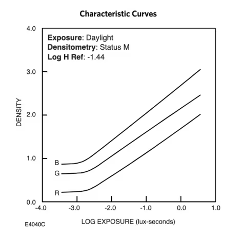
Ektacolor Pro 400 has an impressive dynamic range of about 12 stops, according to the characteristic curve posted in their datasheet (same as Portra 400). This is more than most consumer digital cameras can offer today, and that property may even be stretchable further with various scanning and development methods.
To understand how I got it from the 3.5 lux-seconds you see in the graph below, read this.
Kodak Portra 400’s film characteristic curves. Kodak technical datasheet 2016.
Let’s put this in context. The human eye is often estimated to have between 10 and 14 stops of dynamic range; others quote it at 20. Many top-of-the-line digital cameras can record just over 13 stops.
Another important aspect of that measurement is that overexposed film does not clip like a sensor: while you may still lose detail, most overexposed films, particularly Ektacolor Pro 400, will look better than overexposed digital photographs without needing any modifications.
The results you get with Ektacolor Pro 400 will depend greatly on what you’re printing on or the DMax of your film scanner. Whatever it is, with Ektacolor Pro, you’re likely to have the best luck in high-contrast scenes and when metering using the Sunny 16 rule.
In fact, Ektacolor Pro 400 is so flexible that you can meter it at ISO 100 and develop normally without significantly sacrificing the information stored in your image. As a result, your results will look less “realistic”; however, this effect may be exactly what you’re looking for.
Ektacolor Pro 400 / Kodak Portra 400 with Chinon Bellami. Over-exposed by +2 stops with crop and colour-correction.
Pastel colours with Ektacolor Pro 400.
Ektacolor Pro’s impressively wide dynamic range makes it an excellent candidate for experimentation with the pastel look and deliberate overexposure.
Pastel colours have been a trendy way to render images on film in the 2020s. It’s a lovely effect that, with practice, can create pleasing, stark results — and there are many sub-genres and sub-techniques that can participate in this look.
While some scenes and scans will yield the look naturally, the pastel look isn’t particularly obvious or easy to achieve without additional work, which includes lighting, colour grading, and scene selection. I covered all those techniques in detail here:
Ektacolor Pro 400 / Kodak Portra 400 with Kodak Retina IIIC.
Grain structure, resolution, and sharpness.
Some films are obviously grainy, while others are comparatively smooth. Yet measuring how grainy a film is is a complicated process fraught with assumptions and dead ends. Under a microscope, film grain is a clump of chemicals that can form in an infinite number of shapes.
We generally perceive it as small or large, but also soft or high-contrast. For example, grain can appear small but with soft edges, which can simultaneously add definition and reduce sharpness in an image. Additionally, most modern emulsions have a variable range of grain sizes, with the largest ones being sensitive to low light and the smallest ones appearing in highlights.
The RMS grain measurements used a device and calculations to yield a single number that could be compared across stocks, but that system could easily be “cheated” by films like the discontinued Fujifilm Natura 1600, which boasts a value of 4, which is finer than most films ever made. That’s because those measurements are taken in the highlights, while that’s only a part of a complete image.
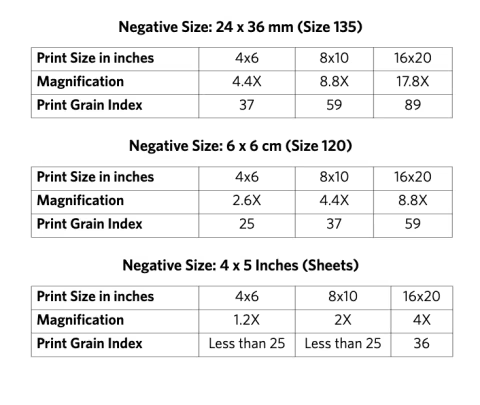
To counter these issues, Kodak introduced PGI, a survey-based approach that asks participants to identify grain in sample images.
PGI is not a single number; rather, it is an average estimate of how grainy a print will look at various enlargement sizes with various negative sizes as the source. Based on that measurement, Ektacolor Pro 400 appears to have a somewhat finer grain than Kodak Gold 200. Although it’s still chunkier than Ektacolor Pro 160 and Kodak Ektar. This is a common trade-off for speed (film sensitivity), which is double that of Kodak Gold’s 200 at ISO 400 and four times that of Ektar.
PGI does not mention grain sharpness, which refers to the amount of definition around the edges of the film particles. While Ektacolor Pro’s grain is relatively fine, it is still noticeable, particularly in 35mm film scans, as is usually the case for all colour-negative films. If you’re looking to completely hide it, you’ll need to shoot this film in larger formats, pick a lower ISO film, or shoot slide film.
Of course, you can also manipulate the size of your Ektacolor Pro 400’s film grain by changing how you expose it. Less light will necessarily make chunkier granules, whereas overexposures will give you a smoother look. Still, I recommend you avoid underexposure and consider the potential colour shifts resulting from overexposures (see “pastel colours”, above).
Ektacolor Pro 400 is Kodak’s best effort, using the most advanced technology for this category of colour-negative film. It’s not as expensive as some other films on the market, yet it’s up there.
In 2026, it sells for $17-30 per roll of 35mm, but it is also available in other formats, including 120, 4x5, and 8x10, at a higher cost per frame. These prices will depend on where you are located and who you’re buying this film from. If you’re in North America, you will get the best deal (since that’s where the factory that makes it is).
But regardless of where you are, if you can afford it, I would recommend giving it a go. Ektacolor Pro 400 may be the best photographic material of its type ever created in the entire 200-year-old history of photography, while its competition is either hard to get or discontinued.
It can take five hours of work (or more) to write and proof a quality five-minute read with high-res illustrations. Below are the people who made this one possible. All content is reviewed, styled, and edited by Dmitri.