How to Fix Lucky C400 Film Scans
Turn Those Piss-Yellow Frames Into Something Beautiful
8 min read by Dmitri.Published on . Updated on .

Lucky C400 (review) is a brand-new colour-negative film made in China. It is the second colour film produced in the PRC since 2012 (the first being Lucky C200, launched last year).
This film has been highly anticipated since Lucky C200 was well received as a viable and affordable alternative. First glimpses of this film appeared on 抖音 Douyin around the 2026 Lunar New Year (February 17). They all looked great — but when this film had finally made it across the pond, some photographers noticed an odd green-yellow tint that made scanning particularly difficult.
In this short guide, I’ll discuss possible reasons this may be happening, how to fix it, and share my working files so you can experiment using your image editor of choice.
In this guide: My setup. The problem. How to fix (in Photoshop). How to fix (Affinity). How to fix (GIMP). Download the working files. Support this blog & get premium features with GOLD memberships!
My setup.
I’m using Nikon SUPER COOLSCAN 5000ED to scan my Lucky C400 film using the VueScan driver. 5000ED is a high-resolution, high-speed dedicated 35mm film scanner and is practically vintage (made around the early 2010s). It’s also considered one of the best tools for the job to this day.
I archive my scans as digital negatives with all-neutral settings, then create an inverted copy with film Q.
The software stack makes the biggest impact on the inverted image colours. If your scanning setup is different, your issues may manifest differently (though the core problem should still be essentially the same). I’m including my working files here so that you can test your workflow.
If you’re having trouble with your Lucky C400 scans, ensure that you are receiving high-resolution “flat” (low-contrast) scans before applying fixes from this guide. The best file types are 16-bit TIFF files or camera RAWs. Your lab may be able to provide you with some of these — just ask up front.
I’m testing an early batch of Lucky C400 with “400T” marked on the edges (scroll for example). It’s possible that not all batches have this problem or render it to such a degree. Depends on your luck, I guess, haha.
The problem.
Lucky is unlike any other colour film on the market. Both the C200 and C400 versions feel thicker than other films, and after development, they appear milky until dry. Their film mask is orange, but it’s of a different hue than those of Kodak or Fujifilm. C200 isn’t particularly difficult to scan: my images came out looking right with little or no edits — but that is not the case with Lucky C400.
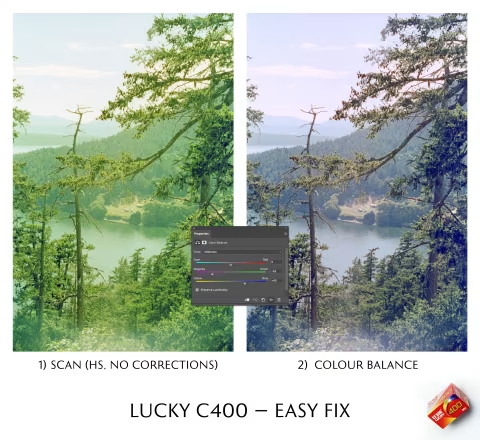
While some freshly scanned frames of my Lucky C400 film were relatively easy to fix using the Colour Balance tool by simply reducing the green in the midtones (see example at the top of this article), that was not the case for many other frames on my roll.
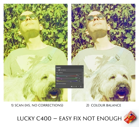
As you can see, applying the Color Balance layer effect is not enough to fix the extreme colour casts that Lucky C400 produced in a portrait of Noodle and me above.
This image had a complex yellow-green cast that couldn’t be corrected with the Color Balance tool alone. After several hours of experimenting and reviewing my and others’ scans, I’ve deduced that the issue may stem from the film base colour, which renders a strong blue cast in areas that need to be black when inverted using the histogram stretching method.
An unusual shift in colour quality of this magnitude is likely to throw various negative inversion techniques off balance. Indeed, I’ve noted a similar trend in Norbi Whitney’s early review of this film, who pointed out that increasing exposure (i.e., by reducing the shutter speed or opening up lens aperture by about a stop) improved his results. Norbi had his film scanned by a local lab using their Frontier scanner and at home with his digital camera using various inversion apps. Derrick Buckner also confirmed similar issues during home scanning with an RGB backlight (all three channels on).
A closer look at the negatives confirms that the frames that are easier to fix (like the one at the top of this article) have less of the bright-orange mask showing.
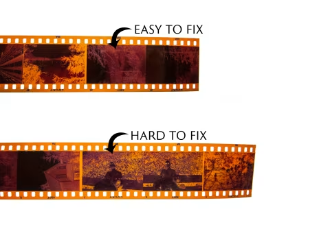
The amount of unobstructed mask colour that appears in the frame isn’t always guided by the exposure alone. The “hard to fix” negative is actually slightly overexposed; it has plenty of dark purple areas that obscure the mask. What I think actually helps is a flat or high-key lighting ratio. In other words, a quality of light that yields scenes with no pronounced or deep shadows.
So, how do we fix those casts when the exposure isn’t a 1:1?
How to fix (in Photoshop).
First, I’d like to reiterate that your scanning hardware and inversion software may produce different results from mine. The fix I’m proposing here is meant to address the worst-case scenario I’ve experienced, but I will describe the principle behind it so you can apply it to your workflow. I will also share my work file so that you can use it as a starting point for your colour correction.