Why Are Film Comparisons So Hard?
A Monthly Newsletter for GOLD Members
11 min read by Dmitri, with image(s) by Betty and Daren.Published on .


This month’s newsletter is a little late — my excuse: camping!
It’s been an eventful summer, full of short trips around British Columbia and lots of experiments on film. I’ve tried several new stocks, which are currently being written up — and tested some new cameras. New podcast episodes are coming soon (on video!), while the toughest project involved shooting 16 rolls of film in two hours — more on that later.
In this newsletter, I’d like to talk about the complex nature of colour-negative film and why it’s so difficult to distinguish various stocks (once they’re out of the box).
Most comparison tests fail to identify and illustrate the actual differences between colour-negative stocks. But there are ways to make those tests more accurate — even if that means going against our instincts.
Let me explain.
In this newsletter: Why are film comparisons so hard? Can we edit our film stocks to look identical? What is the point of comparing film stocks? How to make film comparisons more accurate. Support this blog & get premium features with GOLD memberships!
Why are film comparisons so hard?
The reason many film comparisons fail to find actual differences between colour-negative film stocks is a lack of control and wrong expectations.
Photographers who have compared their colour film scans to others’, tried several labs, or scanned film at home know that their results may vary significantly between the scanning setups. The internet is full of posts proclaiming success while comparing a lab scan to their own for colour, contrast, etc. But while the differences between techniques can create such obvious dissimilarities, many are still confused or misled by the suggested advantages and disadvantages of the numerous colour film options available today.
Here’s why it’s so hard to definitively tell colour-negative films apart:
1. Identical camera and scanning settings can still produce inconsistent results on the same roll of film.
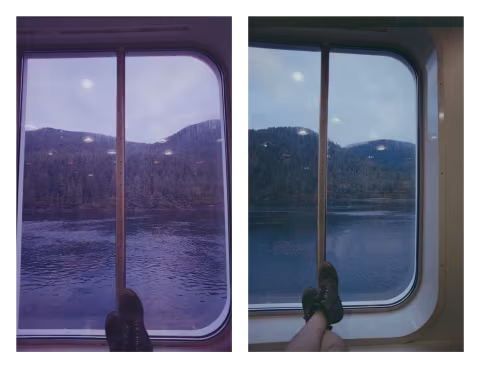
There are, of course, potential differences in the scene itself, which can influence camera meter or the quality of light, but even more so, your scanner’s interpretation of an image is often inconsistent or ambiguous (even if you sample the orange mask and apply that sample to the entire roll).
Film scanners adjust their automatic exposure settings from frame to frame, which can dramatically alter the colours of a scan.
After an image is acquired from a scanner or digital camera, the film inversion software needs to interpret the colours of a scan. This is not a set-it-and-forget-it kind of thing, as these tools have to adapt to different films, mask colours, and other properties that vary between emulsions. Each of those apps may do it differently, but we often don’t know why, because app makers don’t like to explain how their tools work (but I do).
Your results may fall within your expectations of consistency, but they may not be precise enough to demonstrate the real difference between two film stocks. Even if you sample an orange mask and use the “roll analysis” feature, there may still be inconsistencies between frames due to hidden algorithms making adjustments based on image content (see the illustration of this effect with Negative Lab Pro and the Roll Analysis feature above).
2. Colour-negative film is an ever-changing physical medium that requires interpretation.
Harman had publicly admitted that they make changes to their emulsion from batch to batch. Kodak’s updated Ektacolor Pro films that succeed the Portra series seem the same, yet the emulsion is noticeably thinner.
In addition to deliberate changes to the formula or film base at the factory, colour film can degrade in shipment or storage due to temperature and other factors.
Even darkroom printers have to make several test prints to optimize colour for individual frames. Similarly, analogue minilab machines use densitometers and other sensors to interpret colours and adjust development settings for each new roll.
Despite those inconsistencies, films of the same lineage can be corrected to create a consistent look — whether with filtered light in a darkroom or digital manipulation of a scan. At the same time, it is harder to make one film look like another (see below).
3. The actual differences between films may be meaningful but very slight.
Film comparisons that deliberately alter film stocks to look distinct from each other are invalid. Instead, the right thing to do would be to match the colours of films in question as much as possible. When we fail to make one film look like another digitally, we find a difference between them that’s strong enough to persist across various scanning, printing, and editing techniques.
However, as we edit the scans to look similar, unsurprisingly, the differences between the films become slight. Few creators like to spend their time and money to come to a conclusion like that, and so it’s understandable that many comparisons do the opposite to wow the audience.
Colour film manufacturers are likely after the same thing: colour accuracy, which inevitably pulls their products to render light in ways that conform to human perception. We don’t see all wavelengths, and our visual system adapts to various lighting conditions (e.g., indoors/outdoors) in ways that photochemical and digital sensors do not — so manufacturers create various technologies to make their products work more like our eyes.
Still, creating a high-resolution image sensor that works like human perception is complicated and expensive; there is no single approach to achieve that goal. On film, the differences between those approaches are often strong enough to persist even after digital edits or changes in the scanning process.
Sometimes, those differences are slight; other times you may actually succeed in making one film look like the other — at which point you may wonder, if you like the look of film A, is it worth your time to keep buying film B and edit it to look like A every time?
Can we edit our film stocks to look identical?
The answer is the same for film as it is for digital photography: it depends.
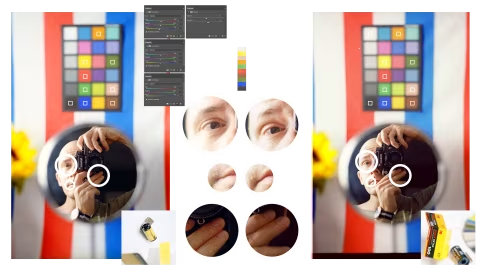
For example, if you crush the shadows, increase saturation, and match colour casts between Kodak Pro Image and Kodak Ektar (two very different emulsions made by the same company), you may fool someone into thinking they are the same film on a tiny screen.
However, on a high-definition scan, adjusting the colours to match in one place can noticeably shift the rest of the picture off balance. I think I did a pretty good job matching Pro Image to Ektar above, yet you may still see some differences in how they render the colour swatches.
Perhaps you can’t see the differences between the films on your screen, and if that’s the medium you expect to display all your scans, there’s no reason for you to spend more on Ektar — although you would have to contend with having to edit your film in a particular way each time.
Some film stocks differ very slightly, so much so that they can be made to look virtually identical with just a few edits. For example, my comparison of the US-made Fujifilm 200 and Kodak Gold revealed that the films differ mostly in their sensitivity to light, not in colour.
Others, like Harman Phoenix and the new German ISO 200 colour-negative film, are extremely distinct. Those products would be impossible to make look alike without destroying a lot of image fidelity.
What is the point of comparing film stocks?
There are hundreds of brands to choose from today, many of which use materials sourced from just a few places — packaged in different boxes. This world was confusing for me as a beginner, and it would remain a mystery if I didn’t take the time to study it.
Shedding bias and uncovering the properties that make films distinct helped me understand their true value, while readers have shown appreciation for that knowledge by coming back, contributing their experiences, and sharing my work.
Some film stocks would turn out to be identical — knowing which saved photographers time and money. When Kodak released Kodacolor 200 last year, the film sold for considerably more than ColorPlus at most shops due to novelty. However, those films are the same thing, as my tests and the physical markings on the developed strips have revealed.
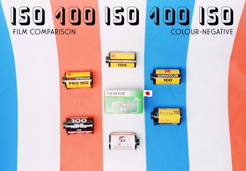
Others, like Pro Image 100, Kodacolor 100, and Lomo 100, render colours and contrast very closely. This could make those films functionally identical in some cases, yet I found enough differences to help myself and others choose from the three.
The differences between colour films are never elaborated or explained by the manufacturers beyond general marketing speak. But knowing them for what they are helps us understand our creative options and make better choices.
How to make film comparisons more accurate.
Good experiment design is a complex task. There are limits to how precise the measurements can be in any setting, and it’s important to be aware of those limitations to draw truthful conclusions from the findings.
For example, my film comparisons aren’t blinded. This technique, meant to isolate the results from the experimenter’s bias, isn’t feasible without involving many more people. Even with best efforts to eliminate it, there may be some slight bias in my comparisons.
However, there are a few factors that should be controlled, which should help minimize bias:
1. Light. Daylight can rapidly change temperature, direction, and intensity throughout the experiment. I’d be hesitant to accept any film comparison that isn’t shot under studio lights.
2. Lens & camera. Lenses vary in their colour and contrast renderings, whereas film cameras may have their shutters fire at slightly different timings.
3. Camera settings. Exposure (aperture & shutter) and focus should be the same across the frames being compared. Changing those will change how the film looks.
When comparing how films handle exposure, I typically choose -2, 0, +2 (where 0 is normal exposure against an 18% middle grey card and -2/+2 are under- and overexposures by two stops). Single-stop under- and overexposures can be too slight to identify.
4. Content. If you’re photographing different things, the images will look different. Even if a single meaningful component of a scene changes (e.g., you remove a red ball from a mostly green scene), there’s a chance that the scanner will calculate the inverted colours differently following the change.
What’s in those frames is also important. I find that simply having a colour chart or an inanimate object is insufficient for an effective film comparison. Having a human face makes it much easier to spot differences in colour rendering, as identifying skin tones is what we’re good at.
It’s also worth considering your model’s complexion, as it can affect the differences seen between films.